Table of Contents
Want to get in on a little secret? There are three fundamentals for how to make a slide deck that puts your brand on a new level. We use this framework to bring presentations from “needing some work” to “good to go”!
- The Big Idea
- The Brand
- The Bow
What’s The Big Idea?

The biggest mistake most marketers make when putting together a presentation is incorporating too many ideas or points on one slide. What is the single message you’re trying to convey?
A poorly designed presentation or deck will cram too much information on one slide. This will leave an audience overwhelmed, bored, and possibly frustrated.
Think of your favorite movie. Could you describe it in just a few words? Could you convey the messaging behind your favorite song in thirty seconds or less?
That’s The Big Idea.
When constructing your presentation design, ask yourself the following two questions:
- What’s the single message of my presentation as a whole?
- What’s the single message of my next slide?
People can only retain so much information
Your audience will never remember your entire presentation. Too much information delivered at once will dilute your message.
We recommend providing singular key points on each slide. This allows people to more easily absorb the information and ensures that your audience is taking away the same points.
Construct a presentation similar to an instruction manual. Steps are broken down, line by line, into chronological, digestible pieces. Presentations should follow a similar format — the Big Idea displayed on one slide will build the next.
Keep your audience engaged, not bored
A long list of bullets is a quick way to lose your audience. Many people aren’t inspired when presented with a long block of text. And even if they read that block of text, they will probably zone out when you begin talking, assuming you’re about to reiterate what they just saw.
Sticking to one idea per slide allows you to utilize different mediums to convey your messaging.
Use imagery to spice up your slide deck
Graphics give a presenter more latitude. A bunch of words on a screen limit what a presenter can talk about and how they can say it.
The Picture Superiority Effect is the notion that concepts which are learned by viewing pictures are more easily and frequently recalled than concepts learned by reading their written word counterparts.
When a presentation is packed with text, an audience will disengage from both the slide and the speaker. Adding imagery gives the audience visual support to the speaker’s message.
Try sites like Unsplash or Pexels for copyright-free, high definition stock photos, and download the The Noun Project Google slides add-on to access over 2 million custom icons.
The Brand: Incorporate Branding in Your Presentation Design
A strong brand identity is one of the most valuable assets a company can own.
A logo, a tagline, unique color schemes, and other graphic elements are what set one business apart from the rest. These elements are applied to websites, ads, and social media. They should be incorporated into presentations as well.
Presentation decks represent a company the same way any other asset represents the company. Whether you’re selling externally or training internally, you’re showing others an essential component of the business.
Stay consistent to reinforce your brand
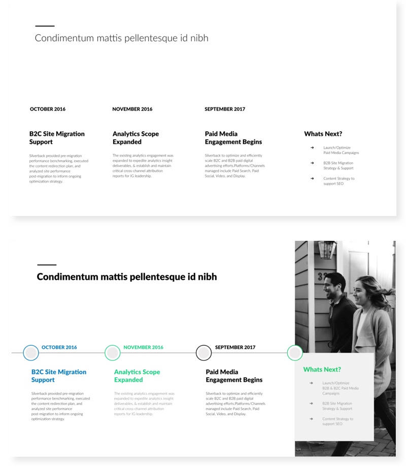
Consistency is a fundamental component of marketing. Consistency in the delivery of your messaging strengthens what you are communicating about your business. The uniformity of visual messaging is as important as the consistent usage of the brand voice.
Before presenting, go through your deck and check for consistency. When multiple people are working together on a deck, it’s easy for each section to look disjointed.
When creating a presentation, you should review company brand guidelines to ensure you are using the correct:
- Logo (including the correct size and format for the medium you are using)
- Typography
- Color Palette
- Iconography
Include the logo on the first slide of your deck. If possible, include it on every slide. Refer to brand guidelines as to not alter, stretch or realign the logo.
Stick to one font throughout and ensure that it is in the same typeface family as your logo.
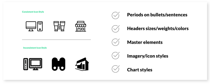
Additionally, ensure that the following elements are the same throughout:
- Alignment: Decide whether you will align right, left, or center.
- Spacing: Tracking and kerning ratios should maintain a consistent style when font size changes.
A note on alignment: People read from left to right, so that’s the most legible alignment option due to its predictability. Headings above left-aligned text should also be flush left. Centered headings pair well with justified text.
The Bow: Add Finishing Touches to the Slide Deck
Marketers who want to know how to build a slide deck can learn a few things from designers. We do a few key things that might not be noticeable right away, but make a huge difference in making a presentation look and feel polished.
Just like a gift always looks nicer with a bow on top, these small touches will polish your presentation.
Align the elements on each page of your slide deck
Ensuring that everything is evenly spaced is the best way to make your slides look as polished as possible. This includes:
- Margins
- Text
- Boxes
- Icons
- Photos
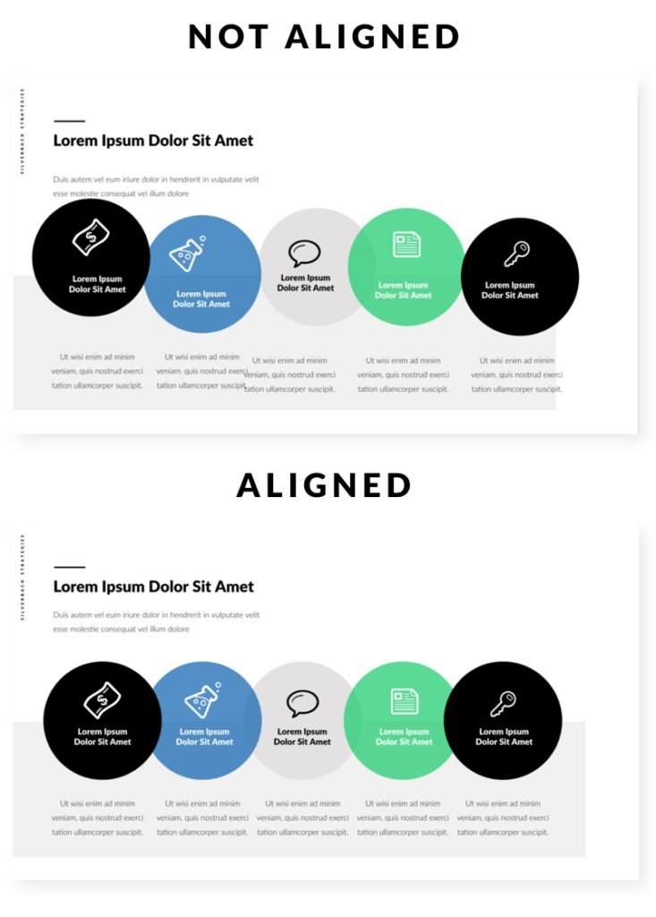
Line Length
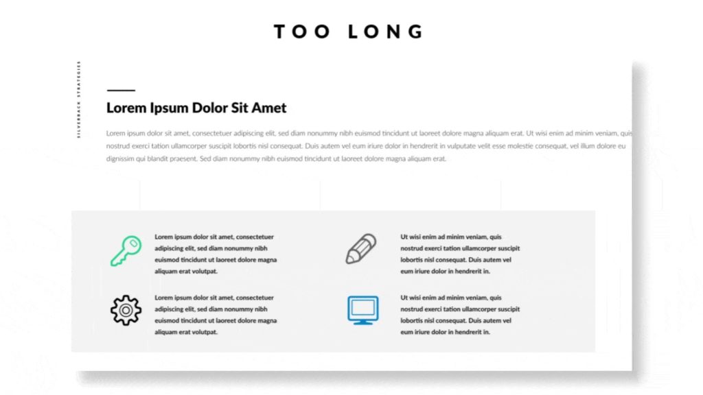
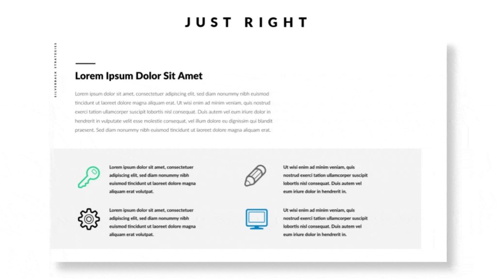
There is no magic number that dictates how to construct a perfect line, however, research shows that reading slows and retention rates fall as line length begins to exceed 12 words.
A good rule of thumb is to evaluate text on your slides with the eyeball test: If you have to move your eyeballs significantly to read it, the line is too long.
Image Effects
Doing one or two extra effects to your images can really solidify your concept. Some examples of image effects to use in your presentation include:
- Cropping and masking: The crop tool allows you to remove any unwanted sections of an image. Cropping helps bring focus to the relevant part of the picture. Masking allows the user to add shapes over the top of your picture to hide the unwanted parts.
- Transparency: This can be used on both images and shapes. Transparency fades a background image so that the text becomes the focus and is easier to read.
- Drop Shadow: Drop Shadows are a tiny detail that can change the look of your whole presentation. It’s the simplest way to add depth between layers of shapes and images on the slide. A drop shadow creates a more 3D-like appearance.
- Image Callout: This is a visually powerful tool. In a callout, you layer a circle over top of an image to call attention to a specific portion. This can be used to draw focus onto specific faces in a crowd, for instance.
- Border: Adding a simple border around your images can sometimes help them look more polished. Be sure to use a consistent border weight throughout your presentation.
Don’t want to make a slide deck yourself?
Learning how to make a slide deck that stands out is a skill, just like copywriting or data analysis.
Well-prepared, summarized content in combination with beautifully-crafted slides will result in engaging presentations.
Interested in chatting with one of our talented designers? From web design and social video to blog illustrations and infographics, Silverback’s Creative team can help you synthesize and polish your brand’s look and feel. Contact Us to learn more.


